


REEL EMERGENCY – Show Branding
As part of my work with Axon’s First Responders Network (FRN), I led the visual redesign of the REEL EMERGENCY podcast to elevate its presence within the FRN streaming ecosystem. The brief was to reposition the show as a flagship clinical education series—one that communicates urgency, credibility, and real-world relevance to its audience of EMS professionals.

The redesign centered on developing a bold, cinematic show card system that would stand out in-app and scale across social, episodic, and campaign contexts. I introduced a visual language inspired by field recording equipment—using REC icons, timecodes, and lens overlays to give the series a “live from the frontlines” aesthetic. The typography is condensed and authoritative, paired with a trauma red and black palette that evokes critical care while remaining clean and professional.

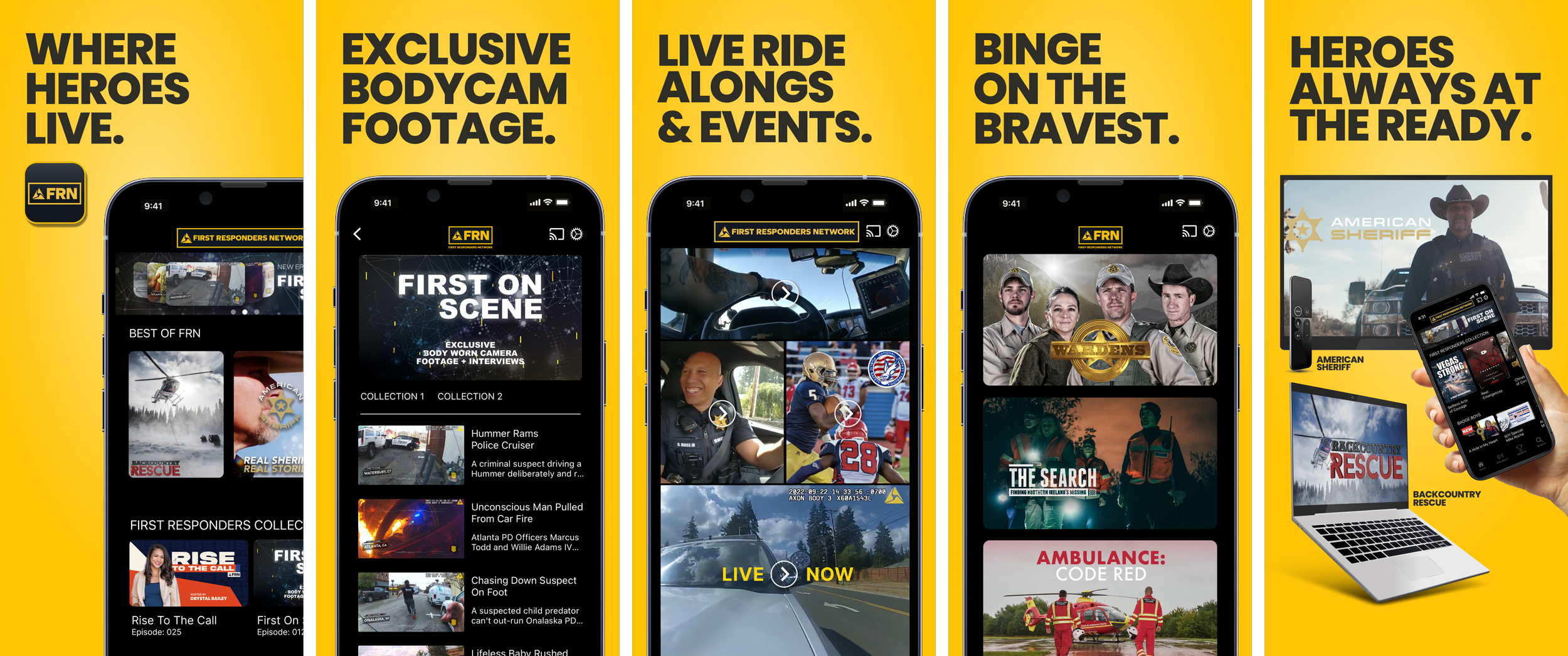
These FRN convention kiosk graphics use bold, minimal design to deliver a powerful and unified message: "Where Heroes Live." The consistent use of yellow and black instantly commands attention and reinforces brand recognition. The visual structure is clean and direct — with the FRN logo always central — making it easy to absorb from a distance in a busy convention setting.
The inclusion of real first responders adds authenticity and emotional weight, while lines like “Where Family Protects” humanize the message and broaden its appeal beyond action to values like community and trust. The QR code and call to action ("Strengthen Our Community — Join Now") create a low-friction path for engagement. Overall, this suite of panels does exactly what strong event creative should: spark curiosity, communicate brand values instantly, and invite people into the story.